But Can I Swim In It?

Communicating Water Quality Successfully

F. Ryan O’Donnell

2026-03-10

Overview

  • Introduction to me
  • Water quality communication challenges
  • Case study: Creating Clearer Charts
  • Case study: Revamping Is It Clean

Who Am I?

  • B.S. Geology (2011) & M.S. Sustainability Sciences (2013) from UMass Amherst
  • 2012: Volunteered in Connecticut River Conservancy’s (CRC) water quality lab testing E. coli samples
  • 2013: Vermont Agency of Natural Resources Intern supporting Southeastern Vermont Watershed Alliance (SeVWA) and Ottauquechee River Group monitoring programs
  • 2014+: Continued coordinating SeVWA program and supporting CRC lab and other various projects
  • 2017: Started Deerfield River Watershed Association (DRWA) monitoring program covering both MA & VT portion of watershed
  • 2018-2025: Became CRC’s water quality program manager bringing together CRC’s MA & CT monitoring with SeVWA and DRWA programs
Water Quality Communication Challenges

Why is it so hard?

  • As scientists, we want to communicate precisely
  • Audiences have varying skill levels of interpreting data
  • Water quality data is complex and noisy
  • Data can be both overabundant and sparse
  • Water quality professionals are used to looking at this stuff!
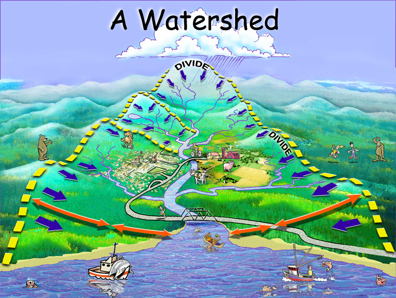
What am I?

What am I?

Start from the basics

I start every presentation with this image

Case Study: Creating Clearer Charts

The Problem

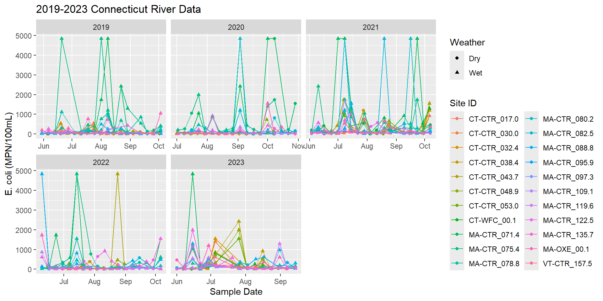
  • How do we present five years of E. coli data clearly?
  • Samples collected by volunteers over five years in three states
  • CT & MA sampled on different days of the week, VT sampled every other week
  • Weather conditions may be different across such a large area
  • Include in a report for colleagues, volunteers, and the public to review on their own

The source of the problem

The Data
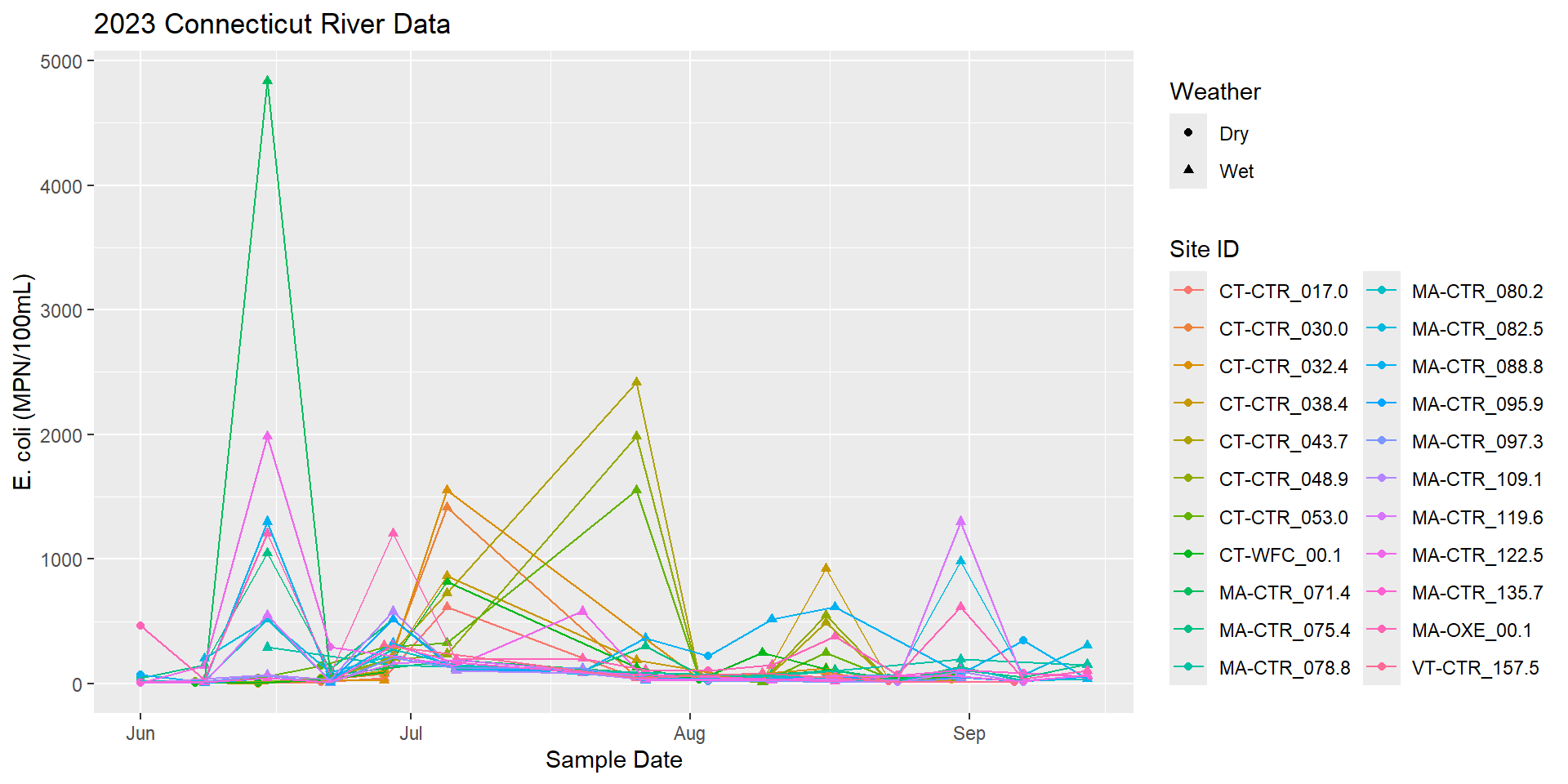
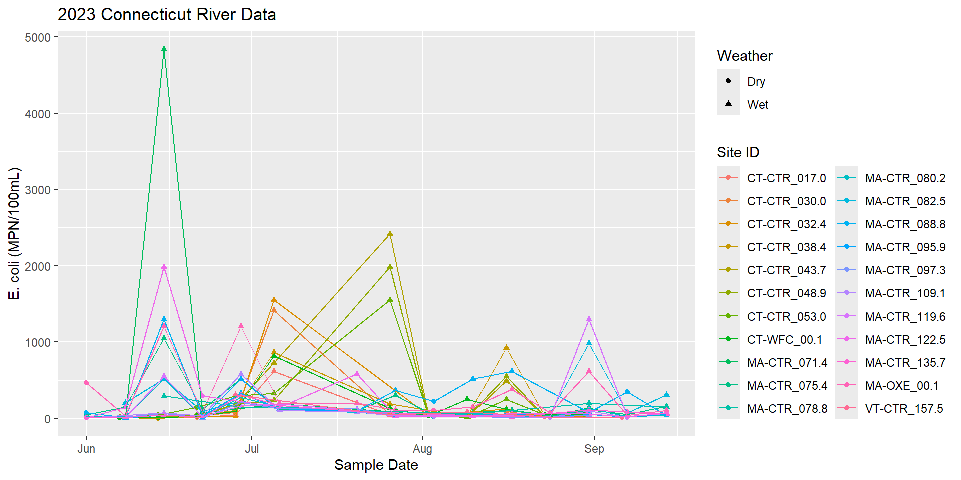
  • Here is just one year of data
  • What results are good? Bad?
  • Where are the sites?

The Data

The Data

Adding more data doesn’t make it better…
Telling a story with data

  • Important information:
    • Bacteria levels are different in wet and dry weather
    • Where each site is located relative to each other
    • Some colloquial information about sites
    • What are the standards, when/where are they being met, and what does that mean for the river user?
  • Tools
    • Clear, familiar color coding systems
    • Thresholds clearly marked on graph
    • Pair a simplified map with a graph of the results
    • Bonus: Interactivity!

My Favorite Graph

See the rest of the report.

Case Study: Revamping Is It Clean

Is It Clean?

  • Website launched in 2012
  • Part of a partnership with the Pioneer Valley Planning Commission
  • Showcase E. coli data being collected throughout the Connecticut River Watershed
  • Bilingual
  • Had a side-mission of serving as CRC’s lab’s water quality database
  • Built in Drupal with lots of custom code

Through the ages

  • Challenges along the way
    • Funding for ongoing maintenance and updates
    • Web developers didn’t understand water quality
      • Lat/Long was backward the ENTIRE time even though we constantly asked for it to be fixed
    • Switched web developers and they didn’t understand website and couldn’t make any changes

From the ground up

  • Worked with The Commons
  • Identified available tools that would work for CRC goals
    • Moved all CRC water quality data out of Excel into AirTable
    • Separated Is It Clean partner data out of CRC data
    • Developed ideal vision for the new website and created RFP
  • Fedo.Studio developed Is It Clean
    • Weekly meetings from wireframes through to custom code development
    • Took the time to understand water quality data and what we wanted to communicate

Meet the new website

Is It Clean

Questions?